
 -The name of the artist is at the top (and can be seen clearly)
-The release date (out now) is in big writing and can be seen easily.
-I have given information about the popular songs that are featuring on the album.
-Information about record company is displayed at the bottom as well as the logo.
-I have used the same image that is on the album cover so that the magazine is easily recognizable and can therefore be associated with my artist.
 -The font used is the same font used in my digi-pak which again enables people to associate the font with my artist.
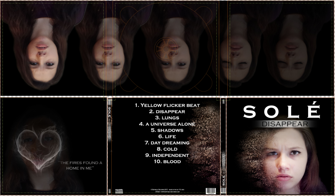
To ensure my digi-pak was effective I made sure that it followed a similar theme to my magazine advert as well as my music video. I included some song lyrics in the third panel of my digi-pak which relates to the actual image shown (Both consist of fire) they are also lyrics from the song I used for my music video. This is often done by actual artists and is a way of advertising the album to the audience and emphasizing a message about the artists character. Another way in which my digi pak relates to the music video is the fact that the music video shows my artist escaping from society, (which is shown by her escaping to the woods) this message is also shown in the lyrics. Similarly, In my digi-pak the artist appears to be disappearing in a different way in all the panels, which can be seen as a way of escaping, (The album Title is also called "Disappear").
My actual music video I also feel goes nicely with the digi-pak as the theme of the video as well as the lyrics suggest the she wants to disappear from normal society as well as her middle class lifestyle, (which is evident through the mise-en-scene in the dinner table shots) similarly, the front cover of the digi-pak also shows her face literally disappearing which nicely personifies the message.
Ultimately, I feel as though the combination of the two products is highly effective at conveying my artists message. This is also enhance as I used conventions of the genre to put this across. (e.g. cutting to the beat as I mentioned in the previous post). I also feel that this product effectively shows the audience characteristics of my artist as the mise-en-scene and the costuming suggest influences from gothic culture. (e.g. the dark colours that she is wearing as well as the dark background of the digi-pak.)
I feel as though all the products I have created successfully/effectively coveys the character of the artist to my target audience through the visuals. I believe that when the products are recieved, the audience will immediately know the artists "star text" and her character (which is gothic and rebellious)
No comments:
Post a Comment